How to pick the best server based on Latency and Throughput

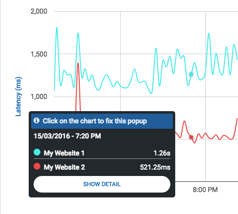
Choosing an optimal server location isn’t necessarily an easy task. Managing costs and selecting an appropriately sized hosting package is just one part of the deal. As much or more important than server capacity, is finding out how your services behave from your client’s perspective. Whether it is for choosing among different hosting providers or deciding in which location it is better to deploy your server, you need to measure latency and throughput. Having an insight into these two metrics can improve your service and result in cost-effective solutions.

In this article, we take a look into these two basic aspects of connectivity: latency and throughput. We discuss their behavior and show you how to use CloudPerf to compare and choose an optimal server for deploying a web page.

As we know, TCP performance is naturally limited by Latency. As for this, the first aspect we have to look into a server’s performance is Latency, then focus on throughput. No matter how big a link may be, if your users experience a high latency, it is not possible for them to achieve high performance. The next graph, shows the interdependency of Thoughput vs. Latency.

tcp-speed-limit

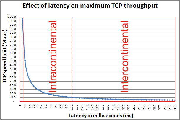
Here we can observe an inverse exponential curve, which in practical terms, it means that especially in the 1-30ms range, every millisecond of latency will have a heavy effect on the maximum achievable performance. With this in mind, we can picture very clearly the intuitive notion of choosing a server as close as possible to your clients, but still take into account even the smallest differences in latency.

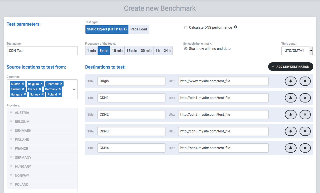
Let’s say we have an account with a cloud provider and we want to deploy a service for European users. We can take Digital Ocean as an example, where we can deploy a VM in Amsterdam, London or Frankfurt, among others. We deploy the same test service on each of those locations. Then we set up a Static Object measurement for them in CloudPerf pointing to a 100KB test file and a Ping measurement to each server. We make sure to select the countries of our interest and start measuring. We choose to measure for one hour, one measurement per minute.

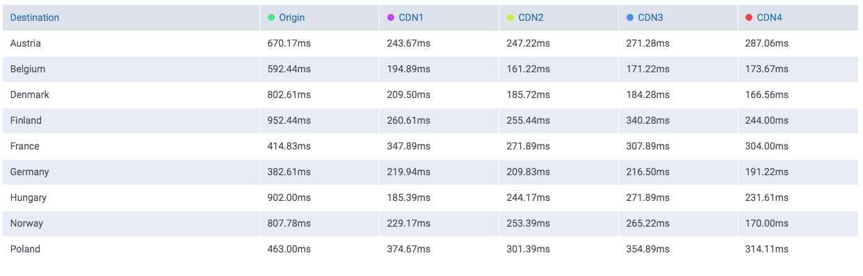
The following table shows the latencies obtained from each location to each of the three servers. The lowest latencies have been highlighted in yellow.

latency-table

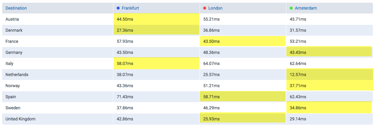
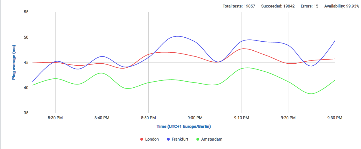
We can observe that depending on the countries we are serving to, we can expect a very different result for each server. But focusing on all countries altogether, we can say that Amsterdam and Frankfurt have the lowest latencies in general. Let’s confirm that with the graph:

latency-graph

This is one for latency, but what about throughput? Given similar enough latencies, like in this case, the effective TCP Throughput may be affected by other factors, so we take a look at the download speeds achieved for each server, now the highest Throughput has been highlighted in yellow.

throughput-table

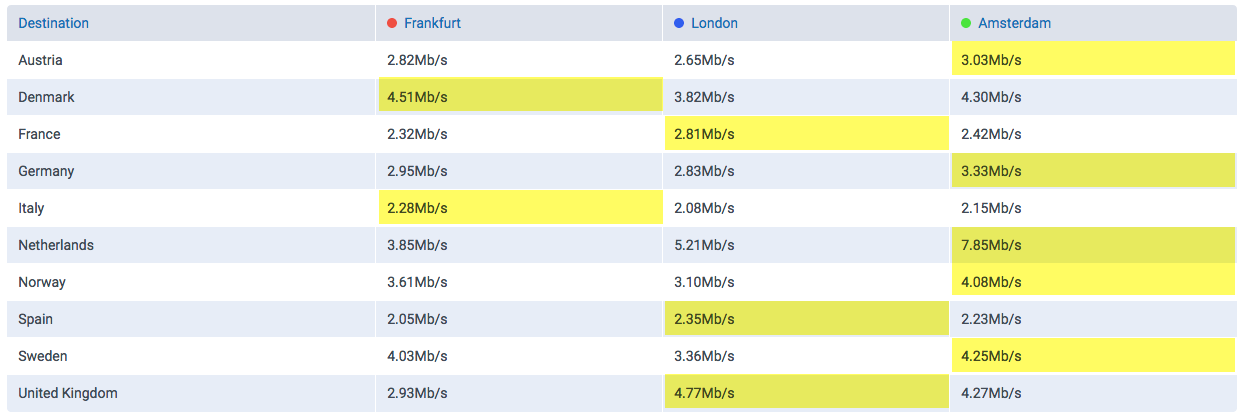
Here we can clearly observe that clients from Austria and Germany, which showed ping values favorable to the Frankfurt server, actually show a higher throughput when serving from Amsterdam. Let’s take a look a the graph:

throughput-graph

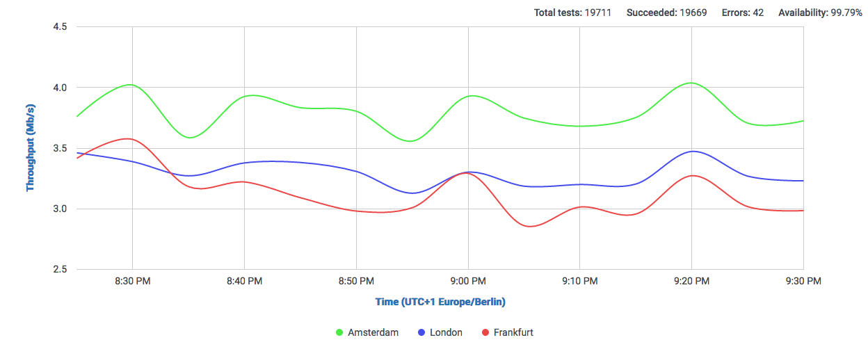
No we have confirmed that our Amsterdam server will show the best performance. Of course results will vary depending on which countries we focus on, but we can clearly see a general advantage of using Amsterdam as a single location for this selection of countries.

Announcing new Feature: Page-Load Waterfall Analysis

Here at Speedchecker, we are aware of our customer’s requirements and we strive hard to build our products not only robustly and precisely, but also expand on features which will help everybody to diagnose their sites performance in greater detail, while at the same time , retaining that ease of use and clarity our customers love. Today we proudly announce the introduction of a new feature in CloudPerf: a detailed view of all your measurements. This feature is especially useful for frontend developers, who need to examine if the webpage loading time is not impacted too much by including slow external resources such as 3rd party tracking scripts or assets.


Inside your Benchmark’s results page, just move the mouse pointer along the graph  and click once in the position you would like to take a deeper look. The pop-up windows will stay after your click and you can go inside the detailed view by clicking “Show Detail”.

Screen Shot 2016-06-22 at 16.57.44

In this view you can see a panel on the left side, where you can choose the benchmark where you would like to take a closer look, the country of the measurements, destination website and the time range for which the results will be shown.

Screen Shot 2016-06-22 at 17.26.12
On the top you can see a timeline where after selecting the time-range you can choose with precision the time of the day you want to take a look into. Directly underneath the list of measurements made at that time will appear, showing the details of every single one of them.
Screen Shot 2016-06-22 at 17.26.22


If you are running a Page-Load Test, be sure to check the box “Collect resource timing data” in its configuration before running it. If you did so, using this new feature will be enable you to take a look using a very cool and useful Waterfall Chart, which will show you the loading times of every resource of the site you are measuring, for every single measurement in the time-range you selected. This way you can follow the behaviour of your services in detail over time.
waterfall
I hope you enjoy this new addition to CloudPerf and overall we expect it helps you to gain a greater insight into monitoring your resources.

Sign up now!

Measure and compare CDNs with CloudPerf

In this tutorial we show you a practical application of CloudPerf, which is measuring and comparing CDNs. Since nowadays the CDN market is bigger than ever and equally diverse, we think it is very important to be able to compare and analyse CDN performance using an independent measurement platform before making any decision. This way you can see and compare by yourself using the same measurements across all providers of your interest.


It is important to take into account, that CloudPerf makes last-mile measurements, that is, right there where your users are. That is especially useful to contrast what CDNs or other providers say about their services and what your users are actually experiencing in real time.

Preparing your setup

    •  Make sure you have an account with CloudPerf, if not, you can get a free trial account on this link.
    • Make a list of all the URLs you would like to measure directly from your site. In this example we will use only one url to compare with four CDNs.
    • Make sure to compare a copy of the same file across all destinations.
    • Make sure all your URLs use the same protocol (http or https).
    • Set up your test domains for measuring your service with your desired CDN. You can get trial accounts on most CDNs. You can also setup a series of subdomains for testing many different CDNs with your content. So subdomain1.mysite.com is linked to CDN-1, subdomain2.mysite.com is for CDN-2 and so on.
    • Confirm that all your testing sites are using similar DNS configurations. CNAME cascading can affect measurements greatly and lead to unrealistic results.

In general, keep in mind that for testing purposes, it is best to configure all links as similarly as possible. Depending on the options each CDN gives, most of them can also provide test files for comparing their services. Some of these test files can also be found in the web. Nevertheless, we think that measurements are more meaningful if you test directly with your content. Especially if your site mixes cached and uncached content or if your site updates frequently, caching times become more relevant in the equation.

Screen Shot 2016-04-20 at 17.31.48


* NEW * – CloudPerf now offers pre-configured links to popular CDNs for your convenience. Just click the drop-down menu on the “Create New Benchmark” button in the Dashboard and select “CDN Benchmark”. The benchmark editor will now include a list of checkboxes with popular CDNs so you can compare your own destinations with our current selection of CDN providers. We will be adding more and more CDNs with time!


Configuring CloudPerf

In this example, we will set up a comparison between one static object against 4 CDNs. Once you have everything prepared, log in to CloudPerf and you will be taken to the Dashboard. Click on “Create new Benchmark”. You will be taken to the benchmark editor.

Screen Shot 2016-03-23 at 01.00.41
We name this benchmark “CDN Test”. We chose to measure a Static Object, but this example is also valid for using Page Load. Since we want to run the test for some hours, a 5 minute frequency is OK. For longer or permanent tests, you may want to measure less often. We select a number of countries in which we are interested to run the measurements.


CloudPerf uses a technique we call “Connection pre-warming”, in which two subsequent requests are made with every measurement: the first request will need DNS resolving and therefore will report longer measured times, while the second request has already a resolved DNS and will only report the connection time to the server. You have the option of including the DNS lookup time in your results.
This time we choose not to include DNS lookup times in our measurements, so we can observe in our results the “pure” connection time to our destinations.


For the first destination, we input the direct link to our origin server against which we will compare the CDNs’ performance. We chose to name it “Origin” and under URL we input naturally the direct link to the file we will test. Click on “Add new destination” and another line will appear. We name this and the subsequent lines with the CDN’s respective names, in this case, we simply numbered them. In the URL box we put either the address of the subdomain you previously configured to work with your site or any other link to a static object or web page to measure. For this post we compared one of our homepages with four real CDNs serving the same file.

Screen Shot 2016-03-23 at 01.15.06
Click on “Save & Update” and voilà! We have configured our benchmark to measure our site and some CDNs simultaneously from thousands of different locations. We only have to wait now and take a look at the results after enough samples are taken.

Viewing Results

If enough time has passed, our first results will be ready. We simply log back into CloudPerf and once in the Dashboard view, we click our measurement’s name, which will take us to the results page.

By default we see first the latency measurement graph. The first thing we can notice from these results is that using any of those CDNs will make our website more responsive.

Screen Shot 2016-03-23 at 11.16.36

If we remove the origin from the graph using the destinations buttons, since it is the slowest URL in this experiment, the graph will automatically zoom in and you will be able to observe and compare all four CDNs much more clearly. Please note the color change of the graph lines after modifying the destinations.

Screen Shot 2016-04-20 at 19.00.43

You can use the results table below for having a first look at the measured latencies by country.
Screen Shot 2016-04-20 at 19.03.24
If you wish to see the measurements over time in the countries of your interest only, you can select them using the Tests Running From field. You can also switch the graph between destinations and location using the Group By option.


It may be very intresting to compare results using different statistics. For example, if we select the 25th Percentile (faster connections) we can observe that CDN4 clearly outperforms the other three CDNs:
Screen Shot 2016-04-21 at 00.49.02
while selecting the 95th Percentile (slower connections) our results show us longer latencies, but less clear differences between CDNs, although maintaining the general tendencies among them.
Screen Shot 2016-04-21 at 00.54.49


Remember that CloudPerf is a very flexible tool and can be used for much more than measuring CDNs. Please take a look at our Quick User’s Guide and explore all the powerful options that CloudPerf has to offer!


Sign up now!

A study on the coverage of ProbeAPI and RIPE Atlas

Ripe Atlas has been successful in establishing a fairly well extended network of measurement Probes. They are placed in different environments, which can be server rooms, volunteers ‘offices, universities and households. Since the placement of a probe requires a physical device to be installed, the deployment and growth rate of the network is limited to the available physical distribution capacities and the cost of producing enough physical devices. On the flip side, this quality of being a hardware based measuring platform, not only guarantees a stable availability of the probes, but also there is a genuine piece of hardware that allows any customizations the measurements may require.

Top 20 Atlas by Users

Although Atlas has already achieved an impressive number of deployed probes, there are still large networks in need of coverage.

ASN Country(ISO 2 letter code) Users(APNIC Labs estimate) RIPE Atlas probes(online)
AS4134 CN 336 million 2
AS4837 CN 204 million 0
AS9829 IN 66 million 0
AS7922 US 55 million 336
AS17974 ID 47 million 1
AS8151 MX 39 million 4
AS24560 IN 33 million 5
AS8452 EG 33 million 0
AS4713 JP 30 million 8
AS7018 US 29 million 40
AS9121 TR 27 million 8
AS3320 DE 26 million 206
AS28573 BR 24 million 20
AS45595 PK 23 million 1
AS9299 PH 22 million 5
AS9808 CN 21 million 0
AS701 US 20 million 80
AS45899 VN 19 million 1
AS18881 BR 19 million 8
AS4766 KR 18 million 8

In this respect ProbeAPI can provide much relief. Because of its software-based nature, it has many complementary features that provide very interesting strategic flexibilities. For example, its deployment has a very low cost: it only requires the installation of a piece of software on a Windows computer. Being able to measure real user’s connectivity is a big advantage, but at the same time the normal usage of computers make ProbeAPI instances very volatile: personal computers go on and offline for different reasons during their normal usage.

We can note by observing both graphs, that there are still large networks with little coverage from ProbeAPI. ASNs 4134 (China Telecom), 4837 (China-168) and 9829 (India Telecom) are good examples of large networks with a comparatively small number of probes.

Nevertheless, ProbeAPI’s easy deployment gives us the possibility to be present in networks where too little or no physical probes have been installed.In our measurements, the number of available probes in ProbeAPI at a given moment is around 84000. During a normal usage day, more than 290000 became online. Although not all probes are online all the time, the number of available probes at a given moment is almost 8 times RIPE Atlas’ active probe count. This counterweighs the volatility problem of ProbeAPI’s instances, but for longer measurements from a static set of probes, the stability of Atlas Probes is an important fact to take into account.

It is important to remark that this comparison does not intend to establish technical superiority of one system or the other. Quite at the contrary, during this analysis we realized that in this respect, Atlas and ProbeAPI may contribute complementary features for measuring networks. For low-coverage, physically or politically hard to reach networks, a software solution like ProbeAPI may be a viable alternative in order to be able to first expand our general measurement coverage. Once a region starts installing more Atlas probes, longer measurements with fixed sets of probes become available thanks to Atlas’ more stable probes.

In this stage ProbeAPI’s end-user perspective can provide the convenient point of view of the last mile’s conditions. Combining the stability and precision of Atlas’ probes, with the massive amounts of possible measurements from end-user perspective, we can get a very well detailed portrait of the network’s condition.

Currently there are around 74000 active probes from ProbeAPI and Atlas monitoring the same ASs. ProbeAPI has around 14000 probes measuring networks where Atlas isn’t present. On the other side, Atlas has around 1700 probes where ProbeAPI is absent. Combined they give a grand total of around 95000 active probes able to measure networks serving almost 2.9 Billion users.

 Conclusion

The software-based design of ProbeAPI helps us achieve a vast coverage, even achieving the impressive number of 4000+ available probes for a single AS. Of course, the natural instability of the probes is an inherent constraint of ProbeAPI’s architecture, but that is the trade-off in exchange for a very extended and fast growing measurement network.

On the other hand, RIPE Atlas is designed around physical devices installed in diverse locations by hosts. This physical design brings the inherent stability a physically independent device can provide. Probes can be placed strategically in different points of the net other than only end-users, where measurements can reveal valuable information about the net’s conditions. All This requires some host recruiting, so this distribution process is naturally slower than a software one.
There are essential architectural differences between ProbeAPI and RIPE Atlas. Both systems were designed with a similar set of measurement features in mind, but their differences in design end up opening different doors, which in return give us the possibility of observing the net from a large number of diverse vantage points.

Testing Google Cloud Platform CDN Interconnect with CloudFlare on ProbeAPI

As many of you might have already heard, Google has introduced a new cooperation program with four CDN providers: CloudFlare, Fastly, Highwinds and Level3. The Google Cloud Platform CDN Interconnect Program consists on giving CDN providers access to route their traffic through Google’s private high-speed links, so they can serve their customers through reliable, low-latency routes thanks to Google’s infrastructure.

After reading the news, the ProbeAPI team got curious to find out how much of a performance gain is there to expect using this service, if any at all. Taking advantage of the large number of probes available at ProbeAPI, we set up an experiment to put this interesting new infrastructure to the test.

We used Amazon’s S3 and Google Storage as cloud storage providers and CloudFlare as CDN. To test similar routes, we chose the server in Singapore for our Amazon S3 bucket and the Asia server for the Google Storage bucket. We chose a maximum of 100 Probes in the USA as destination for our transfer tests.

After connecting and configuring the buckets to make them accessible through the CDN, we put the files to be tested in the buckets: several randomly generated 1.1MB PDF files, since PDF is one of the file extensions cached by CDNs.

Our objective is to measure the transfer times of those files and find out how long does it take to the CDN to cache those files for each storage provider. That means: we want to compare the transfer times of a cached file vs an uncached file from each bucket. We take the difference of those transfer times and we get the time it takes the CDN to cache a file, based on the delay caused by the caching and assuming that a previously cached file will transfer faster.

We test two files per bucket, let’s call them A and B. We make a pre-test running a Http Get test from ProbeAPI calling only the A file from both buckets. Running this pre-test made file A get cached in the US Servers of CloudFlare. Now we are in condition to run the real test. So we ran an Http Get test using ProbeAPI with files A and B on both buckets. So this is what happens: We cached file A with the pre-test, because of this, file A is expected to transfer faster than file B, which will have to be transferrred from Asia to the US CDN servers like file A did on the first test. Because this takes a bit extra time to do, we can calculate the overhead caused by the caching.

Results

After just a few tests with ProbeAPI, the first thing that strikes you, is the amazing speedup in transferring files preloaded in the CDN cache, especially for Amazon servers. There was also a noticeable improvement in the uncached Amazon’s performance after the 5th Test. Either because of sudden changes in network conditions or some load balancing mechanism reduced the caching overhead enormously because of that route being used repeatedly by hundreds of probes across the US.

Now getting to the point. We can observe Amazon’s amazing speedup when the file is already cached, even surpassing uncached Google Storage performance after some tests, which is already fast by itself.

Google’s buckets performed well altogether and that’s where we can clearly see the power of this infrastructure. The overhead introduced by the caching process when using Google + CloudFlare is minimal compared to the one introduced from Amazon + CloudFlare. This is due to the evident performance upgrade brought by this new partnership with Google, with CloudFlare now being able to use Google’s infrastructure to transfer data from the Datacenter to the CDN in the blink of an eye.

Caching Overhead Asia to US

We decided to run the tests once more, using the same methodology but transferring files from US servers to probes located in the US as well. This is a very likely scenario, thus making this set of measurements very interesting.

CDN Comparison US to USHere we can observe the expected scenario again: Uncached files take longer to deliver than files already cached in the CDN. In this case the difference is (also expectedly) less dramatic, due to the US-US traffic routing. The uncached files take similar amounts of time to load, although there’s still a noticeable overhead improvement when measuring transfers from Google’s buckets.

Even with your content being available locally in the US itself, the benefits of this CDN-Google partnership are still evident and relevant.

Analysis and Conclusion

We are living exciting times, with the Internet becoming ever faster and adopting more sophisticated connectivity year after year. This is one example of how the Net is adopting optimized structures. Some years ago we wouldn’t have dreamed of having our content available practically locally everywhere in the world, that’s one for CDNs.

Now with this cooperation, not only that is possible, but also your newest and updated content gets much faster to its destination and this is where the major beneficiaries of Google’s Interconnect platform lie, whose content is constantly changing, updating, adding new files and want them to be rapidly distributed for a virtually seamless availability all over the world.

Even with your content travelling shorter distances, like our US-US test showed, the benefits of serving customers faster and more reliably are still very noticeable and could be critical in certain scenarios: e.g. during a flash crowd, when your content (or part of it) becomes highly popular overnight. This would be a critical situation where you want to serve everybody without decreasing the quality of your service. The best part is that it works automatically and such a scenario that haunted administrators in the past, is becoming less and less fearsome thanks to CDNs and now even updated content is able to reach its destination with a short overhead.